Designing Yosemite Desktop
After iOS 7 has received a facelift in 2013, we’ve all been waiting for a similar upgrade for Apple’s industry leading desktop operating system Mac OS X. So, when Apple released OS X Yosemite in 2014, it has completely changed the way we think about designing Mac OS X. Many companies have updated their apps with a new, modern “Yosemite looking” design.
Having an amateur eye for design myself, I really welcomed the new OS X update, as it made the whole system feel new and modern again. But like when iOS 7 was released, there are still many unpolished areas all around the OS. One of the most interesting design features of Yosemite was the dark mode, which changed the menu bar and dock theme into a nice dark one, making the OS look like a professional system.
Many users have adopted the dark mode and apps were updated with white versions of the menu bar icons, to make them look good in dark mode (well, honestly some apps still did not update yet, but better late than never I guess).
But the problem I kept seeing on OS X is not connected to the newly introduced dark mode, but rather to the dock. The icons in dock are always inconsistent in shape, as each developer kind of picked their own style. Apparently even Apple is not very consistent when it comes to OS X icons.
For example, App Store, iTunes, Safari, LaunchPad and Photos use circular shape, Mail, Contacts, Calendar, Reminders and Notes use a tilted narrow rectangle and Finder and System Preferences use a wide rectangle. And of course there are exceptions to this rule such as iMovie, FaceTime, GarageBand and others.
Because I really loved the consistent shape of the icons on iOS, I was looking for a way to fix OS X in my own way. Since already many systems apps are circular, I chose to find circular icons for all my apps.
Lucky for us, we can change the icons on OS X to our own preferences, including system icons! While I was searching around for a quick solution I came across LiteIcon, a simple icon swapping tool. Great, all we need now is some nice looking icons.
There are a couple of sources online that you can find icons:
- Yoios – GitHub
- Ampeross – DeviantArt
- Atopsy – DeviantArt
- BlackVariant – DeviantArt
- Hamzasaleem – DeviantArt
- JasonZigrino – DeviantArt
- JRichSmith – DeviantArt
Of course there are many others that you can find on DeviantArt, just make sure before downloading any icon, that it is in .icns format (so it looks great in all sizes, even in different views in Finder).
I would like to thank all the authors for providing the icons for free.
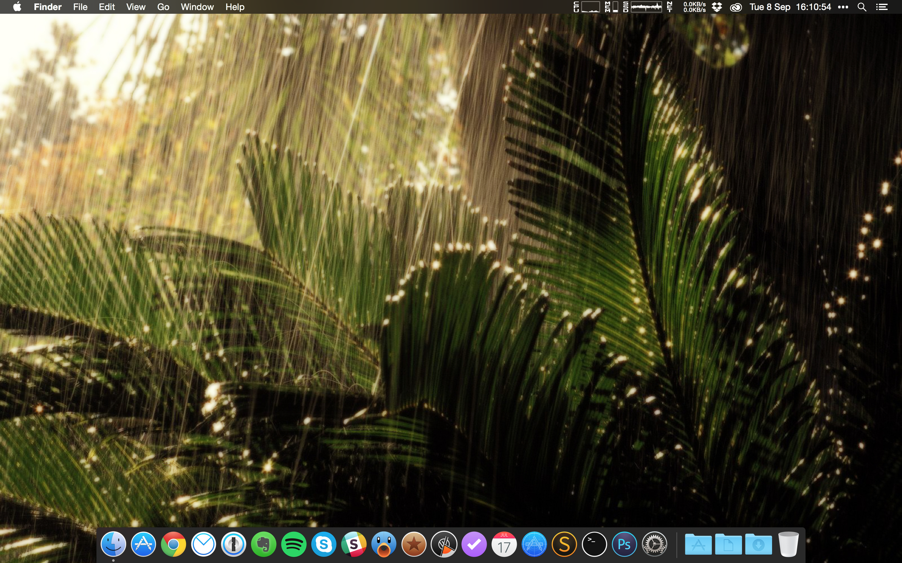
After an hour of searching for the right icons, this is my desktop on MacBook Pro (on both screenshots above and below, click on them for full image) and I am pretty satisfied with the result.
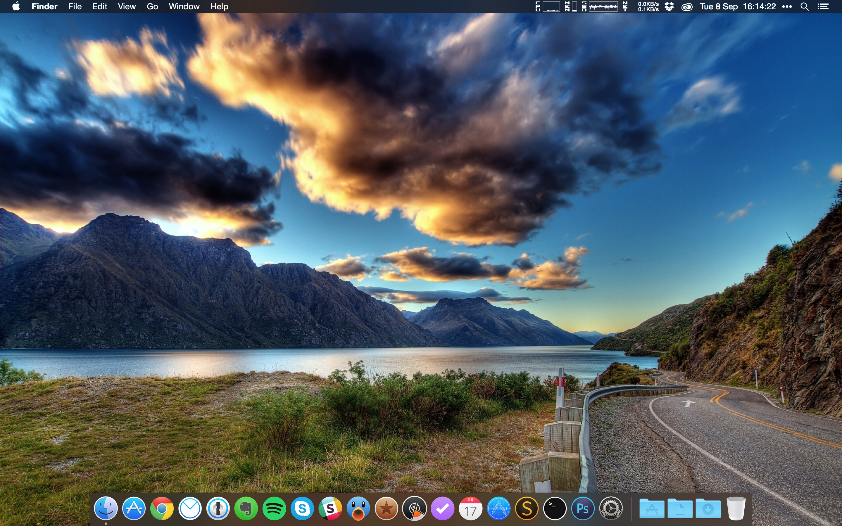
I could find an alternate icon for almost every app I use daily, including 1Password, Slack, Evernote, Skype, TweetBot, OmniFocus and there are also icons for many other common apps. Sometimes there are even multiple versions available, so you can pick which one fits best with other icons in your dock.
There are a couple of downsides though:
- Not everyone will create an .icns icon, you can alternatively use .png, but will not look good on all devices (Finder displays a different type of the icon if it is in List mode).
- Every time an app is updated, the icon will be lost, so it must be replaced again.
- Icons cannot be dynamic. For example Fantastical 2 and Reeder generate an icon when they are open to show additional information. That icon temporarily replaces the set icon, but dock will revert to the one you picked, once the app is closed.
In general I feel much better using Yosemite after the icon update and I also encourage all of you to try it out. Maybe you can find an icon set that you will like.
